Abdulhakim Bashir

My E-Portfolio based on work carried out on my Msc Program on Artificial Intelligence and Machine Learning at the University of Essex.
Unit 9: Charts Worksheet Solutions
Exercise 9.1: Brand Preference Bar Charts
Task: Add a percentage frequency bar chart showing the brand preferences in Area 2, alongside the Area 1 chart.
Data:
- Area 1: Brand A (15.7%), Brand B (24.3%), Other (60.0%)
- Area 2: Brand A (21.1%), Brand B (33.3%), Other (45.6%)
Visual Comparison:
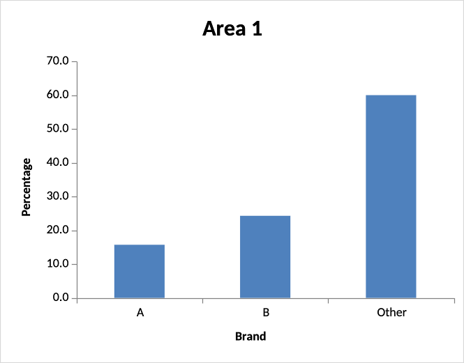
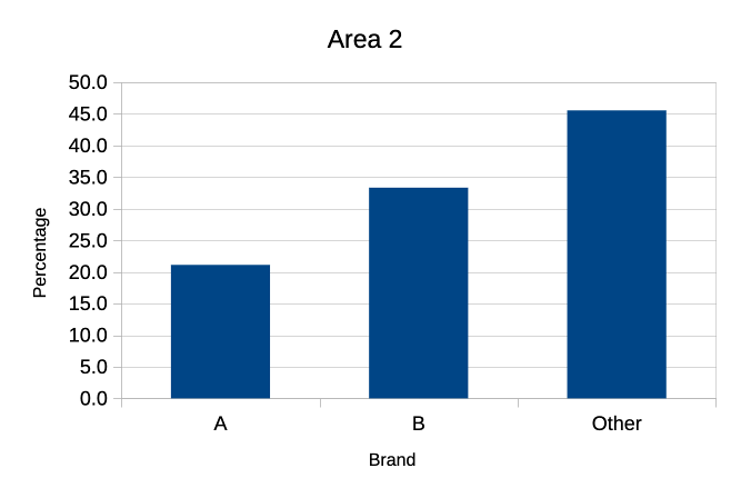
Solution Interpretation:
Area 2 shows higher preference for both Brand A (21.1% vs 15.7%) and Brand B (33.3% vs 24.3%) compared to Area 1. Conversely, Area 1 has a higher percentage preferring “Other” brands (60.0% vs 45.6%). This indicates different brand preferences between the two demographic areas, with Area 2 consumers more likely to choose Brands A or B over alternative options.
File: Exe_9.1D_Solution.xlsx
Exercise 9.2: Clustered Column Chart - Heather Species Prevalence
Task: Create a percentage frequency clustered column chart showing heather species prevalence in two different locations.
Data:
- Absent: Location A (14.3%), Location B (45.5%)
- Sparse: Location A (39.3%), Location B (31.8%)
- Abundant: Location A (46.4%), Location B (22.7%)
Visual Result:
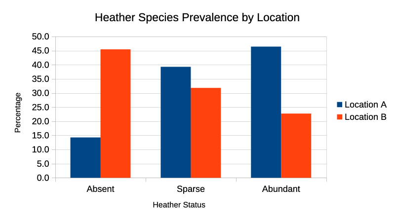
Solution Interpretation:
Location A shows predominantly abundant heather coverage (46.4%), while Location B has significantly more absent areas (45.5%). The pattern reverses across locations - Location A has increasing percentages from absent to abundant, while Location B shows the opposite trend. This suggests markedly different environmental conditions or land management practices between the two locations.
File: Exe_9.2E_Solution-9.2.xlsx
Exercise 9.3: Diet Histograms
Task: Add a relative frequency histogram for Diet B weight loss using the same classes as Diet A.
Diet Statistics Comparison:
- Diet A: Mean = 5.34, SD = 2.54, Min = -1.72, Max = 10.06, Range = 11.78
- Diet B: Mean = 3.71, SD = 2.77, Min = -4.148, Max = 10.539, Range = 14.687
Diet B Results:
| Class Mark | Frequency | Relative Frequency |
|---|---|---|
| -3.5 | 1 | 0.02 |
| -1 | 2 | 0.04 |
| 1 | 10 | 0.20 |
| 3 | 15 | 0.30 |
| 5 | 11 | 0.22 |
| 7 | 8 | 0.16 |
| 9 | 2 | 0.04 |
| 11 | 1 | 0.02 |
| Total | 50 | 1.00 |
Visual Result:
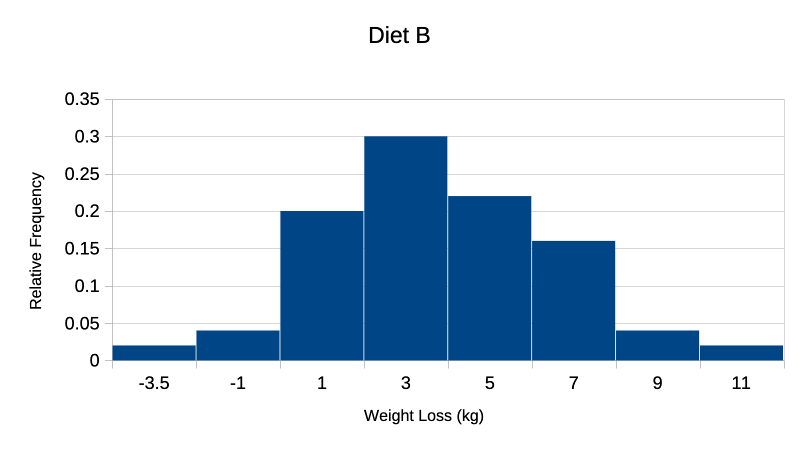
Solution Interpretation:
Diet A shows higher average weight loss (5.34 kg vs 3.71 kg) with Diet B showing greater variability (SD 2.77 vs 2.54). Diet B has a wider range (14.687 vs 11.78) and includes negative weight loss values (minimum -4.148). Diet A demonstrates more consistent results with most values clustered around the higher mean, while Diet B shows a broader distribution with peak frequency in the 2-4 kg range but extends to both higher and lower extremes.
File: Exe_9.3_Solution.xlsx